

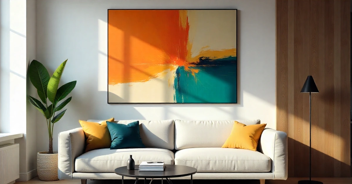
You walk into a room, and something clicks. Your eyes land exactly where they should. That’s not luck—that’s emphasis home art doing its thing. It’s the design principle that separates “meh” spaces from ones that make people stop mid-conversation and ask who decorated. Think of it as your room’s main character moment, where one element steals the show while everything else plays backup.
No degree required, just smart choices about what deserves attention and what should fade into the background.
What Emphasis Home Art Actually Means
Emphasis home art is about creating a focal point that naturally grabs attention without screaming for it. Your eye needs a focal point to rest on when you enter a space. Without that anchor point, rooms feel like visual noise—everything competes, nothing wins, and you’re left with design chaos. The goal is to make one element the star while supporting pieces that enhance rather than distract from it.
Every room tells a story, and emphasis decides which chapter gets read first. That bold painting above your couch? That’s your opening line. Is the vintage mirror catching light in your hallway? That’s your plot twist. When you nail emphasis, you control the narrative instead of letting random furniture arrangements tell it for you.
Professional designers charge big money for this skill, but here’s the secret: you already have the tools. Colour, texture, size, lighting, and placement are your building blocks. Mix them right, and you create focal points that feel intentional, not accidental. You’re also building a clear visual hierarchy—a pecking order for the eye—so your room stops looking like a furniture store showroom and starts feeling like your actual space.
The best part? Emphasis home artworks, whether you’re renting a studio or owning a townhouse. You’re not changing walls or ripping out floors. You’re making strategic choices about what deserves the spotlight and how everything else should support it without fighting for attention.
Why Your Room Feels Off Without It
Walk into any space that feels “wrong”,, and you’ll notice the same problem: your eyes don’t know where to look. Maybe five different colours are competing for attention. Perhaps every piece of furniture demands equal importance. That visual confusion translates to physical discomfort—you can’t relax because your brain is working overtime trying to process everything at once.
Emphasis home art solves this by giving your eyes a starting point and a path to follow. When one element dominates, everything else falls into a natural hierarchy. Your brain processes the space faster, finds it more pleasing, and you actually enjoy being in the room instead of subconsciously avoiding it.
Think about Instagram-worthy spaces you’ve seen. They all have clear focal points—a statement wall, a killer light fixture, or a piece of art that commands attention. That’s not accidental staging for the photo. Those rooms work in real life because emphasis creates a visual order that feels good to experience, not just photograph.
Without emphasis, you end up with what designers call visual weight distribution problems. Translation: everything feels equally important, which means nothing actually is. Your expensive couch gets the same attention as your random side table. That art you love disappears into the background noise. You’re spending money on pieces that don’t get their moment to shine.
Colour Is Your Secret Weapon. Colour contrast creates instant focal points with zero construction required. Drop a deep navy accent wall in an otherwise neutral room and boom—instant emphasis. Your eye can’t help but notice the difference. The trick is commitment: wishy-washcolouror choices create wishy-washy focal points. Go bold or stay neutral, but don’t try to split the difference. A glossy, high-sheen finish on a cabinet or wall takes that contrast up another notch—light bounces off it, making the colour even more impossible to ignore.
Accent pieces work the same way. A burnt orange velvet chair in a grey and white living room becomes the room’s personality. Red throw pillows on a beige couch direct attention exactly where you want it. The surrounding neutral tones aren’t boring—they’re strategic. They’re the backup singers making your lead vocalist sound incredible.
Colour saturation matters as much as the actual hue. A muted teal won’t create emphasis in a room full of equally muted tones. But crank up that saturation—go full peacock teal—and suddenly you’ve got a focal point. Your eye naturally gravitates toward the most vibrant element in any space, so use that biology to your advantage.
Temperature contrast works too. Warm colours (reds, oranges, yellows) pop against cool backgrounds (blues, greys, greens) and vice versa. A warm wood console against a cool grey wall creates natural emphasis without being loud about it. You’re playing with perception, not just decoration.
Size and Scale Make Bold Statements
Go big or go home actually applies to emphasis in home art. An oversized piece of artwork in a dining room becomes the conversation starter before anyone sits down. A massive pendant light over your kitchen island draws eyes up and defines the space. Size creates authority—the largest element in a room automatically claims focal point status unless you actively work against it. That’s pure visual weight in action: bigger simply weighs more on the eye’s scale.
But here’s the catch: scale has to make sense. A tiny painting on a huge wall looks lost, not emphasised. An enormous sectional in a small room creates emphasis through suffocation, which isn’t the vibe. The focal point should be noticeably larger than surrounding elements without overwhelming the actual square footage you’re working with.
Vertical emphasis works wonders for spaces with high ceilings. Floor-to-ceiling bookshelves, tall plants, or stacked art draw the eye upward and make rooms feel grander. You’re using height as emphasis, which most people ignore because they only think horizontally. That’s your advantage—vertical space is prime real estate for creating focal points that feel unexpected.
Grouping smaller items creates the visual weight of something larger. Three medium prints arranged together command more attention than one alone. A cluster of pendant lights over a table creates more emphasis than a single fixture. Your eye reads the collection as one large element, giving you focal point power without needing massive individual pieces.
Lighting Is the Game Changer
Light physically directs attention better than any other design element. Spotlight a piece of art, and it becomes important, even if it’s mediocre. Leave your best furniture in shadows, and nobody notices. Emphasis: Home art leverages lighting to tell viewers what matters and what’s just a supporting cast.
Layered lighting gives you control over focal points throughout the day. Pendant lights over your dining table create emphasis during meals. Table lamps draw attention to reading nooks at night. Accent lighting on your bar cart makes it the party’s centre of attention. You’re changing emphasis based on function and time, which is next-level design thinking.
Natural light creates its own emphasis patterns that change throughout the day. A window wall becomes a focal point when the morning sun pours through. Position furniture to highlight or frame that natural light, and you’re working with free emphasis that literally shifts with the hours.
Dimmer switches are your flexibility tool. Brighten your focal point while dimming surrounding lights, and you create dramatic emphasis perfect for entertaining. Even it all out and the room becomes a functional workspace. Same space, different emphasis, controlled by how you distribute light across the room.
Texture Creates Touchable Focal Points
Rough against smooth makes your eyes stop and notice. A chunky knit throw on a leather couch creates textural emphasis that begs to be touched. A reclaimed wood accent wall in an otherwise polished room becomes the thing everyone remembers. Texture adds dimension that flat surfaces can’t compete with, giving you emphasis through physical depth.
Mixed materials work the same way. Metal, glass, wood, and fabric each catch light differently and create visual interest. A brass mirror frame against a matte-painted wall creates emphasis through material contrast. You’re not just decorating—you’re composing a space where different textures play off each other to highlight your focal point. Intricately veined marble on a fireplace surround or kitchen island does this effortlessly—its natural pattern and texture rolled into one heavyweight focal piece.
Textured walls are the bold move that pays off. Shiplap, exposed brick, or textured wallpaper creates instant emphasis without adding furniture. The wall itself becomes the focal point, and everything else in the room just needs to not compete with it. It’s architectural emphasis that works even in minimalist spaces.
Soft textures in hard spaces create unexpected focal points. A plush rug in an industrial loft draws attention because it contrasts with concrete and metal. Velvet curtains in a modern space add warmth and emphasis through their obvious difference from surrounding materials. The texture becomes the statement because it’s the exception to the room’s rule.
Architectural Details That Steal the Show Without Trying
Some focal points are already baked into your home’s bones. A fireplace mantle is the classic example—it naturally anchors a living room without you lifting a finger. The same goes for exposed beams across a ceiling, which draw the eye upward and add instant character. Arched doorways, columns, and French doors are structural elements that command attention purely through their form and placement.
The smart move? Let them do the heavy lifting. If you have a picture window with a killer view, that’s your focal point—arrange furniture to face it, not compete with it. If you’ve got a grand staircase in the entryway, emphasise it with a runner or a statement light fixture above. These architectural elements already have visual weight; you just need to avoid cluttering them.
Architects and designers plan these moments intentionally, but you don’t need to be a pro to spot them. Walk through your home and look for what’s already built-in and striking. That’s your free emphasis, ready to go.
Contrast, Isolation, and Placement: The Core Moves
Beyond the usual tools (colour, size, lighting), there are three formal tricks that designers use to lock in emphasis. They sound technical, but they’re dead simple:
Contrast. You’re already doing this. It just means making your focal point obviously different from its surroundings—whether through colour, texture, or shape. That bright yellow vase against a grey shelf? That’s contrast doing its job.
Isolation. This is about giving your star some breathing room. A single sculptural chair tucked into an empty corner or a lone piece of art on a bare wall gets way more attention than the same item crammed onto a busy shelf. Isolation removes competition, so your eye has nowhere else to land.
Placement. Where you put something determines its power. Think about what sits at the end of a hallway—designers call that the “termination of a view”. If you hang a great mirror or a bold painting right where a hallway ends, it becomes an unavoidable focal point. The same goes for centring a piece above a sofa or aligning furniture to face a fireplace. Placement is about sightlines, not just furniture arrangement.
Master these three, and you’ll never struggle to create a focal point again.
Positioning Puts Your Focal Point Front and Centre
Where you place something matters as much as what you place. Centre a bold piece of art over your fireplace, and the architecture reinforces your emphasis. Tuck it in a corner, and it loses impact, no matter how great it is. Strategic positioning uses the room’s natural sightlines to amplify your focal point’s importance.
The rule of thirds from photography applies to room design, too. Position your focal point roughly one-third from the wall rather than dead centre, and it feels more natural. Your eye finds it faster because that’s how we’re wired to scan spaces. Off-centre positioning creates emphasis through unexpected placement that still feels right. But don’t forget the flip side—symmetrical framing works just as powerfully. Flank your focal art piece with matching sconces or candlesticks, and the symmetry itself draws the eye straight to the centre. Both approaches work; pick the one that fits your room’s vibe.
Furniture arrangement directs attention like arrows. Angle your couch toward your statement wall, and guests naturally look that way. Position chairs to face your focal point, and you’re using people’s natural behaviour to reinforce emphasis. The room’s layout becomes part of your emphasis strategy, not just a functional necessity.
Height variation creates visual hierarchy. Your focal point should be at eye level when you’re using the space as intended. Art above a sofa?Centre it 57 inches from the floor. Focal point in a dining room? Position it where seated guests see it best. You’re accounting for actual sightlines, not just standing-height aesthetics.
Common Mistakes That Kill Your Emphasis
Too many focal points equals no focal points. Every bold choice you make competes with the last one until nothing stands out. Pick one star per room and let everything else support it. That doesn’t mean boring—it means being strategic about what deserves the spotlight versus what plays backup.
Matching everything creates visual monotony that emphasis can’t fix. When your pillows match your curtains, match your rug, there’s no contrast to create emphasis. Coordinating is fine—matching is death. Permit yourself to mix patterns, textures, and colours that complement without cloning each other.
Overcrowding your focal point is another silent killer. Placing too many knick-knacks on the mantle under your star painting, or piling books in front of your statement sculpture, dilutes its power. Your focal point needs breathing room—literally. Give it space to be seen without visual clutter fighting for the same real estate.
Ignoring scale makes even great pieces feel wrong. A huge painting in a tiny room dominates through intimidation, not emphasis. A small art piece on a massive wall disappears regardless of how beautiful it is. The focal point should be proportional to the room size—noticeably important but not overwhelming the actual space you have.
Poor lighting ruins perfectly planned emphasis. You spent time choosing the right focal point, positioned it perfectly, and then forgot to light it properly. The result? Nobody notices because it’s sitting in the shadows while your random bookshelf gets all the light. Emphasis needs illumination to work—literally.
Making Emphasis Work in Every Room
Living rooms beg for emphasis above the couch or around the fireplace. That’s prime real estate where eyes naturally land, so use it. A large piece of art, a gallery wall, or a statement mirror all work. The key is scale—small art above a long couch looks timid. Go big enough that the piece owns the wall.
Bedrooms need emphasis at the headboard wall. It’s the first thing you see when entering and the focal point while you’re in bed. An upholstered headboard, dramatic wallpaper, or large-scale art creates emphasis that makes the room feel designed rather than just furnished. Everything else—nightstands, lamps, dressers—should support this focal point without competing.
Dining rooms are made for dramatic emphasis. That chandelier hanging directly above the table isn’t just for light—it’s the room’s crown. A striking centrepiece or a large-scale piece of art on the far wall also works. Position these where they land naturally in your sightline when you sit down, and you’ve got instant dinner-party conversation starters.
Kitchens often create emphasis through the backsplash or a statement island. A bold tile behind your range makes it the star. A contrasting island colour draws the eye and defines zones in open-concept spaces. Pendant lights over the island double down on that emphasis, using both colour and lighting to make it undeniably the room’s focal point.
Entryways are your first impression, so emphasis matters even more. A statement light fixture, a bold console table, or an oversized mirror creates immediate impact. You’re setting the tone for the entire home in a small space, so your emphasis needs to work harder and smarter than anywhere else.
Your Space, Your Rules
Emphasis home art gives you control over how people experience your space. You decide what they notice first, what creates the room’s vibe, and what gets remembered after they leave. That’s powerful—and way easier than you probably thought before reading this. Colour, size, texture, lighting, positioning, architectural bones, and those three core moves (contrast, isolation, placement) are all tools you already have access to.
Start with one room and one focal point. Don’t try to redesign your entire place at once. Pick the space you use most, identify what should be the star, and make strategic choices that support rather than compete with it. You’ll see the difference immediately—and so will everyone else.
The goal isn’t perfection. It’s intention. Rooms with clear emphasis feel more comfortable, more personal, and more “designed” even if you’re working with budget pieces. You’re not buying your way to better design—you’re thinking your way there by understanding how emphasis creates visual hierarchy that feels good to experience.
Your home should reflect you, not a catalogue showroom. Use emphasis to highlight what you actually love—the art you picked up travelling, the vintage find from that estate sale, the colour choice that makes you happy. When your focal points are genuinely yours, the emphasis becomes authentic instead of staged.