

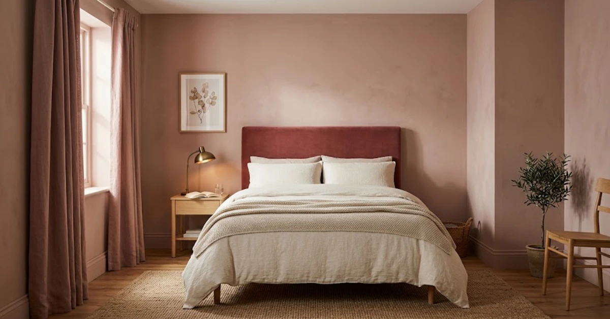
A pink bedroom works best when you choose one muted shade, test it on your wall, and pair it with warm neutrals such as ivory, oak, and aged brass. Soft plaster pinks read calm, while deeper rose tones add drama. Use warm bulbs of 2700K or lower, and avoid mixing several pinks in one room.
Can a pink bedroom look grown up instead of sweet? Yes, and designers still disagree on the best way to do it. In April 2026, AOL carried a forecast from a Decorilla designer who expects dusty and blush pink to fade from bedroom walls. Another 2026 designer round-up says dusty pink lasts because it feels warm and soft. Both views make sense once you look at shade, pairings, and lighting.
This guide helps you plan a pink bedroom that suits adult taste. You will learn which shades to sample, what to pair with them, how to light the room, and which mistakes to avoid. Every tip comes from recent designer advice or from paint brands you can buy today.
Why a Pink Bedroom Works in 2026
Farrow & Ball describes pink bedrooms as warm, charming, and cheerful. The brand also says light pink works as a warmer alternative to a neutral palette. Other guides agree. A 2026 guide from Pink.TV says designers now treat plaster pinks and dusty roses like beige with warmth, because those shades support a room instead of dominating it.
Designer surveys point the same way. The 1stDibs guide to 2026 designer trends reports that 18 percent of designers cited lilac and 16 percent cited mauve as colors they plan to use. Both shades sit close to pink.
Not every designer agrees. Anna Tatsioni of Decorilla told AOL that dusty and blush pink have been a trend for three or four years and now feel a little dated. Stacy Garcia, CEO of Stacy Garcia Design Studio, said cold, overly bright pastels, including washed-out pinks, will feel dated in 2026.
Her point matters for your project. The shades under criticism are cool and pale. Warm, muted pinks with brown, peach, or clay in them are a different choice, and that is where most good pink bedroom schemes start.
Choose the Right Shade of Pink
The shade does most of the work in a pink bedroom. Pink.TV notes that soft, muted pinks read as calming, while saturated hot pinks read as energising. A bedroom is a room for rest, so start with the calmer end of the range.
Four shade groups cover most adult bedrooms:
- Plaster pink: a pale, warm pink that behaves like a neutral. It suits small rooms and rooms with limited light.
- Dusty rose: a muted pink with grey or brown in it. It works well with wood furniture and brass hardware.
- Smoky mauve: a pink-purple that reads more neutral than pink.
- Deep rose: a darker pink for one wall or for a fully painted room.
Texas designer Mimi Meacham likes Farrow & Ball’s Peignoir, which she describes as a soft, smoky mauve that reads more neutral than pink. She says it pairs well with aged brass, marble, and soft ivory upholstery, and that it feels romantic but still modern.
Deep pink deserves its own note. Farrow & Ball calls its dark pink bedrooms bold and deeply comforting. Ruth Mottershead of Little Greene points to earthy pinks such as Nether Red, which she describes as rich, chalky, and calming in fully painted rooms. If your room gets little daylight, a deep shade can still work, but plan your lighting before you buy the paint.
Room size and light should guide your final pick. In a small room, a light plaster pink keeps the walls from feeling close. In a north-facing room, choose a pink with a warm base, since cool light can make a blue-leaning pink look flat. In a bright south-facing room, a dusty rose or mauve holds its colour through the day without turning too sweet.
Pink Bedroom Paint Colours to Sample
Sample before you commit. A paint patch shows how the shade looks on your wall, next to your floor, and under your bulbs. Paint a patch at least 12 inches wide on two different walls, then check it in morning light, afternoon light, and lamp light over three or four days.
Farrow & Ball sells a sample set of Pink Ground, Setting Plaster, and Sulking Room Pink. It contains three 100 ml pots, so you can compare three pinks on one wall. The table below lists shades from the brand’s pink bedroom page.
| Shade | Group | Notes |
| Tailor Tack No. 302 | Light pink | A pale warm neutral with a chalky finish |
| Calamine No. 230 | Light pink | Listed under light pink bedrooms |
| Middleton Pink No. 245 | Light pink | Listed under light pink bedrooms |
| Peignoir No. 286 | Light pink | A smoky mauve that reads more neutral than pink |
| Setting Plaster No. 231 | Neutral pink | A beige-pink with peach, clay, and plaster undertones |
| Pink Ground No. 202 | Dusty pink | Named by designers as a dusty pink option |
| Sulking Room Pink No. 295 | Dark pink | Listed under dark pink bedrooms |
| Rangwali No. 296 | Dark pink | Listed under dark pink bedrooms |
Designer Phoebe Hollond of Studio Hollond suggests Farrow & Ball’s Pink Ground or Benjamin Moore’s Conch Shell for dusty pink. She says the colour endures because it is warm and soft, and because it reads as sophisticated rather than trendy.
Colours That Pair Well With Pink
Pink looks best when it has a clear supporting colour. Hollond recommends pale woods, soft whites, and aged metals. For more contrast, she suggests deepening the scheme with charcoal or olive.
Here are four pairings that work in a bedroom:
- Pink and ivory: keeps the room light and quiet. Use ivory bedding and curtains.
- Pink and oak: pale wood furniture adds warmth and stops the walls from looking flat.
- Pink and charcoal: charcoal on a headboard or one feature wall adds structure.
- Pink and olive: olive bedding or a velvet chair adds depth. Tatsioni says clients now favour earthy tones such as deep olive green and chocolate brown, so this pairing fits current taste.
Trim and ceiling colour also change how pink reads. A warm white on the trim and ceiling keeps the walls soft, while a stark bright white can make a muted pink look dull by comparison. Hold your white swatch next to your pink sample before you buy either one.
Metal finishes matter too. Brushed brass, antique gold, and warm bronze suit pink better than chrome, which can make the scheme feel colder than you intended.
Want more palette options beyond pink? Our guide to bedroom colour combination ideas explains the 60-30-10 rule and shows how dusty pink and charcoal work together.
Bedding, Fabrics, and Texture Ideas
Texture keeps a pink bedroom from looking flat. One rule helps: put the strongest pink in one place and keep the other layers neutral. If your walls are pink, choose ivory or warm white bedding. If your bedding is pink, paint the walls a warm white or soft beige.
Try these layers:
- A linen or cotton duvet cover in ivory or oatmeal
- A velvet headboard in deeper rose or charcoal
- A wool or knit throw at the foot of the bed
- A woven or jute rug in a natural shade
- Wood bedside tables in a single tone
Pattern needs the same restraint. One patterned item, such as a striped throw or a floral cushion set, is enough. If you want a botanical print, keep its background neutral so it does not compete with the wall colour.
Curtains cover a large area, so choose them with care. Panels that match your wall shade usually give a calmer result than panels that match your bedding. Lined curtains also block early light, which keeps a pink wall from looking washed out at sunrise.
Not sure which style to buy? Our bedroom curtains guide compares blackout, sheer, and layered panels, and explains how wide and how high to hang them.
Lighting a Pink Bedroom Correctly
Light changes pink more than most colours. Cool bulbs can make a warm blush look grey, and strong daylight can wash out a pale shade. Test your sample at three times of day, including under your bedside lamps.
The Sleep Foundation advises that a dark bedroom is best for sleep, but warm-colored light is preferable if you need light in the evening or at night. It says red, orange, and yellow light have less effect on circadian rhythms and melatonin than cooler light. That advice suits a pink bedroom well, because warm light also flatters pink walls.
Follow these steps:
- Choose bulbs rated 2700K or lower for bedside lamps and ceiling fixtures.
- Add a dimmer to the main light.
- Place lamps at bedside height, not only overhead.
- Keep any LED strips warm white, and keep power supplies away from bedding and curtains.
If you plan accent lighting behind a headboard, read our LED lights bedroom guide first. It covers colour temperature, placement, and safe setup.
Does a Pink Bedroom Help You Sleep?
Direct research on bedroom colour and sleep is thin. The Sleep Foundation says little research explores the direct connection. Its guide highlights blue, which people tend to associate with calmness and relaxation.
That does not rule out pink. Pink.TV says muted, dusty pinks read as calming and restorative, while saturated hot pinks are stimulating. Use that as a working rule: the lower the saturation, the better the shade suits a room meant for rest.
Be clear about the limits. No study cited here shows that pink improves sleep. Choose pink because you like the room, then use shade, lighting, and curtains to keep it calm at night.
Pink Bedroom Mistakes to Avoid
Most disappointing pink rooms share the same few errors:
- Using several pinks. Pink.TV calls multiple pinks at different saturations in one room the biggest interior mistake. Pick one and stay with it.
- Choosing a cold, bright pastel. Garcia’s warning applies here. Cool pale pinks look dated faster than warm, muted ones.
- Skipping samples. A shade that looks soft on a chip can look sharp on a large wall.
- Covering every surface in pink. Walls, bedding, curtains, and rug in the same tone leave the eye nowhere to rest. Aim for roughly 60 per cent main colour, 30 percent secondary, and 10 percent accents.
- Use cool white bulbs. They pull warm pinks toward grey.
The fix is simple. Pick one pink, let ivory, wood, and metal carry the rest of the room, and test everything under your own lamps.
FAQs
Is pink a good colour for a bedroom?
Yes, if you choose a muted shade. Soft pinks read as calming, while saturated pinks read as stimulating, according to Pink .TV. The Sleep Foundation notes that research linking bedroom colour to sleep is limited, so choose a shade you enjoy.
What colour goes best with a pink bedroom?
Ivory, soft white, pale wood, and aged brass are safe choices. Hollond suggests charcoal or olive when you want more contrast.
How do I keep a pink bedroom from looking childish?
Choose a dusty, plaster, or mauve shade and commit to one pink. Add mature materials such as linen, wood, brass, and marble, and keep patterns to a minimum.
Which pink paint should I try first?
Start with Farrow & Ball’s Pink Ground, Setting Plaster, and Sulking Room Pink in the sample set. Benjamin Moore’s Conch Shell is another dusty option that designers name.
Are pink bedrooms still in style?
Designers disagree. Decorilla’s Tatsioni calls dusty and blush pink dated, while Hollond calls dusty pink enduring. Warm, muted shades paired with natural materials suit either view.