

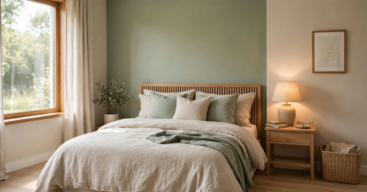
The best bedroom colour combination pairs a calm base tone with one accent shade, split using a 60-30-10 ratio. Sage green with warm beige, dusty pink with charcoal, and navy with warm white are all top choices for 2026. The right pairing depends on your room size, natural light, and the mood you want at night.
Do you walk into your bedroom and feel unsettled instead of calm? The wall colour is often the reason. A bedroom colour combination sets the mood for every hour you spend in that room, from the first light of morning to the last minutes before sleep.
Picking two colours that work together takes more than matching swatches at the paint counter. You need a base tone, an accent, and a plan for where each one goes. This guide walks you through the pairings that designers recommend for 2026, the rule that keeps any combination balanced, and the mistakes that make a good colour choice fall flat.
Why Your Bedroom Colour Combination Matters
It changes how a room feels the moment you walk in. Cooler tones such as blue and green tend to calm the nervous system, while warmer tones such as terracotta and mustard add energy and depth.
Your bedroom carries more weight than any other room in the house. You use it to wind down at night and wake up in the morning, so the palette needs to support both moods rather than fight them. A colour that feels lively in a living room can feel too sharp for a space built for rest.
Light also changes how a colour reads on the wall. A shade that looks soft in a showroom can turn cold in a north-facing room or washed out in a room that gets strong afternoon sun. Test any shortlisted colour on your own wall for a few days before you commit to a full room.
The 60-30-10 Rule for a Balanced Palette
Most designers rely on a simple ratio to keep a bedroom colour combination from feeling chaotic. Use your main colour on 60 Percent of the room, typically the walls. Add a secondary colour on 30 Percent, such as bedding, curtains, or a large rug. Reserve the last 1 Percent for small accents like cushions, art, or a lamp base.
This structure works because your eye always has a clear anchor. Without it, two strong colours can compete instead of complementing each other, and the room ends up feeling busy rather than restful.
Before you commit to paint, test your shortlist properly:
- Paint a sample patch at least 12 inches wide on two different walls.
- Check how the colour looks in morning light, afternoon light, and lamp light.
- Live with the sample for three to four days before deciding.
- Compare the sample against your existing furniture and flooring, not just the paint chip.
Sage Green and Warm Beige for a Calm Room
Sage green has held its place as one of the most requested bedroom colours for several years running, and recent industry data shows the shade posting a 23 Percent jump in paint sales compared to the year before. Its grey undertone means it behaves almost like a neutral, which makes it easy to live with long term.
Paint the walls in warm beige and add sage through bedding, a headboard, or curtains. The pairing feels grounded without turning dark, and it suits both small and large rooms since neither tone pulls too much attention.
If you like this palette, it pairs naturally with a Japandi-style bedroom, which leans on the same warm neutrals, natural wood, and restrained colour count to keep a room feeling settled.
This combination also holds up well in rooms with limited natural light, since neither sage nor beige pulls too cool or too warm on its own. Add texture through a linen duvet or a woven rug to keep the palette from feeling flat, and stick to one wood tone across your furniture so the room reads as planned rather than mismatched.
Dusty Pink and CharcoaGreyay for a Modern Look
This pairing works because the two colours sit at opposite ends of the mood spectrum. Dusty pink brings warmth and softness, while charcoal grey adds structure and a grown-up edge. Together they avoid the overly sweet feel that pink alone can bring to a bedroom.
Use charcoal as your 30 Percent colour on a single feature wall or a large piece of furniture, and let dusty pink cover the remaining walls. Add brushed gold or warm wood hardware to keep the room from feeling cold.
A well-chosen curtain plays a bigger role in this scheme than people expect, since fabric anchors the palette across the whole window wall. Matching panels to your wall shade rather than your bedding usually gives a calmer result, and a lined or layered curtain also helps block early morning light so the pink tone does not look washed out at sunrise.
Keep metal accents warm rather than cool in this pairing. Brushed brass, antique gold, or warm bronze hardware softens the contrast between pink and charcoal, while chrome or nickel can make the combination feel colder than intended.
Navy Blue and Warm White for Depth
Blue remains one of the most consistent choices for bedrooms, and 2026 palettes are pairing it with warmer, less stark companions than in past years. Navy on three walls with warm white on the fourth, or navy as a lower half with white above a chair rail, both create depth without making a room feel small.
One case study on a mid-century-style bedroom found that a single navy accent against light grey walls changed how the room read at a glance, and a survey of designers found that 52 Percent believe a single accent colour on a neutral wall can make a room look up to 1 Percent larger.
Colours like navy work especially well in rooms that get strong natural light for most of the day, since the light balances out the depth of the shade.
Terracotta and Cream for Earthy Warmth
Terracotta has moved from accent colour to full palette choice over the past two years. Paired with cream, it brings warmth into a bedroom without the visual weight of a darker neutral.
This combination suits rooms with wood furniture, woven textiles, or rattan accents, since the earthy tone ties those materials together. Use cream as your dominant shade and bring terracotta in through a headboard, throw pillows, or a single accent wall behind the bed.
Warm lighting finishes this palette better than cool white bulbs do. A soft, amber-toned LED setup keeps terracotta looking rich in the evening instead of flat, so it is worth planning your lighting alongside your paint choice rather than after it. Bulbs rated around 2700K or lower tend to hold warm tones the best, while cooler bulbs can pull terracotta toward a muddier, less inviting shade.
Olive Green and Mustard Yellow for Energy
Not every bedroom needs to whisper. Olive green and mustard yellow bring depth and warmth together in a combination that still reads as grounded rather than loud, since both shades sit on the muted end of their respective colour families.
Use olive as your base on most walls and bring mustard in through cushions, a reading chair, or a single piece of art. Pair the palette with rattan, brass, or warm wood tones to keep the look cohesive rather than scattered.
This combination works best in rooms with good natural light. In a darker room, the two muted tones can pull the space toward looking flat instead of energised.
Lavender and Off-White for Better Sleep
Lavender comes up often in conversations about sleep, and paint retailers list it among the shades most closely tied to a restful bedroom. Its cool, slightly grey undertone keeps it from reading as childish, which makes it a workable choice for adult bedrooms as well as guest rooms.
Pair a soft lilac wall with off-white trim, bedding, and curtains. The low contrast between the two tones keeps the room quiet rather than busy, and the pairing works in nearly any light condition since off-white balances out lavender’s cooler cast.
Avoid pairing lavender with anything too bright or saturated, since a strong accent colour can pull the palette away from the calm effect that makes the combination popular in the first place. One muted metal finish, such as brushed nickel, is usually enough contrast.
How Room Size and Light Should Guide Your Choice
The right bedroom colour combination changes depending on the room you are working with, not just the trend you like.
- Small rooms: Lean on lighter shades for your 6 Percent colour, and keep darker tones limited to a single wall or textile layer.
- Low light or north-facing rooms: Choose warm-leaning colours, since cool tones can look flat without strong natural light.
- Bright, south-facing rooms: Cooler tones such as navy or sage hold up well here, since strong daylight keeps them from feeling heavy.
- Low ceilings: Keep the ceiling a shade lighter than the walls to stop the room from feeling boxed in.
Existing elements matter too. Your flooring, furniture, and any large textiles you already own should guide the palette, not fight against it. A combination that looks great in a photo can clash badly with wood tones or fabric you already have in the room.
Bedroom Colour Combination Mistakes to Avoid
A few habits show up again and again in bedrooms that do not quite work.
- Choosing two colours of equal strength, so neither one reads as the lead.
- Skipping the sample stage and trusting the paint chip alone.
- Ignoring how the colour looks under your actual bulbs, not showroom lighting.
- Matching curtains to bedding instead of matching them to the wall.
- Adding too many colours, which pulls the room away from the 60-30-10 balance.
Most of these mistakes come from moving too fast. A bed colour combination is one of the cheaper changes you can make to a room, but it is worth the extra few days of testing before you commit to a gallon of paint.
Final Thoughts
The best colour combination is the one that matches your room’s light, your existing furniture, and the mood you want at the end of the day. Sage and beige lean calm, navy and warm white add depth, and terracotta and cream bring warmth without weight. Pick a base tone you can live with for years, use the 60-30-10 rule to keep the room balanced, and test your shortlist on the actual wall before you paint the whole room.
FAQs
What is the most popular bedroom colour combination for 2026?
Sage green paired with warm beige or ivory remains one of the most requested combinations, thanks to its grey undertone that behaves like a neutral while still adding colour.
How many colours should a bedroom have?
Most designers recommend limiting a bedroom to two to three main colours, following a 60-30-10 split between a dominant shade, a secondary shade, and small accents.
What colour combination makes a small bedroom look bigger?
Light, cool tones such as soft blue or sage on the main walls, paired with a single darker accent, tend to make small rooms feel larger without looking flat.
Should bedroom curtains match the wall colour or the bedding?
Matching curtains to your wall shade usually gives a calmer, more cohesive look than matching them to bedding, especially in smaller rooms.
Does lighting change how a bedroom colour looks?
Yes. Warm LED lighting around 2700K keeps most bedroom palettes looking rich in the evening, while cool white bulbs can wash out warmer tones like terracotta and mustard.