

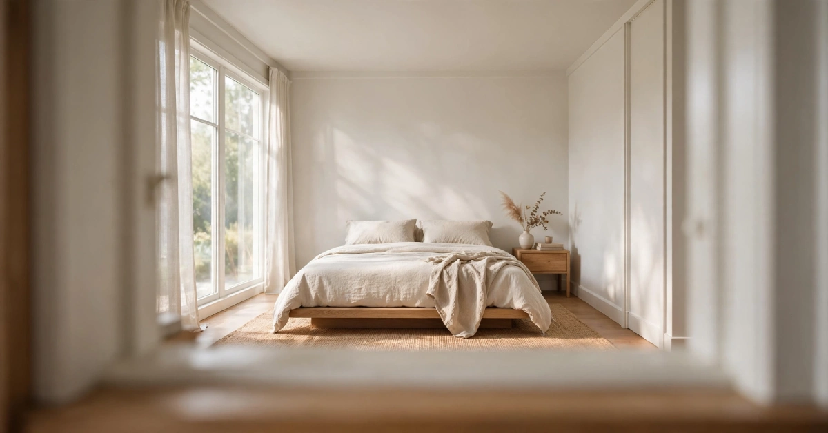
A small room doesn’t have to feel small. Paint changes how a space looks, feels, and even breathes. The right colours can pull walls back, lift a ceiling, or smooth out an awkward layout, all without knocking down a single wall.
But this isn’t just about grabbing a can of white paint and calling it done. Colour choice matters, but so does where you put that colour. A pale grey ceiling can make a room feel taller. A single shade carried across walls and trim can erase visual clutter. Even a well-placed stripe can shift how wide or tall a space reads to the eye.
This guide walks through the paint techniques that genuinely change how a room feels, from colour selection and placement to ceiling treatments, stripes, and lighting. Whether you’re working with a cramped bedroom, a narrow hallway, or a living room with a low ceiling, you’ll find a strategy that fits.
Choose Light Paint Colours to Make a Room Feel Bigger
Light colours reflect more light than dark ones. That reflected light bounces around a room and softens shadows, which makes walls feel less like boundaries and more like background. This is the simplest place to start if you want a room to feel more open.
White and Off-White
White reflects nearly all the light that hits it, which is why it’s such a common choice for small spaces. It brightens a room and keeps corners from feeling closed in.
Off-white tones do the same job but with a softer edge. Because they carry a hint of warmth, they avoid the sterile, clinical feel that stark white can bring to a room, especially one without much natural light.
PaGreyray and Greige
Pale grey and greige (a mix of grey and beige) work well in rooms that need a neutral backdrop without feeling flat. These shades read as calm and current, and they pair easily with most furniture and flooring.
The undertone matters more than people expect. A grey with cool blue undertones can feel chilly in a room with little sunlight, while a grey with warm undertones tends to feel more welcoming in the same space. Check how a sample looks in your room at different times of day before committing.
Pale Blue and Other Soft Colours
Soft, pale colours like blue, sage, or blush can create an airy feeling while still adding personality. These shades work like a quieter version of white: they still reflect a good amount of light but bring in a bit more depth and character.
Use Colour to Create a More Open Colour
Colour placement can matter as much as the colour itself. Painting the walls, trim, and doors all similar shades removes the visual lines that break a room into segments.
Paint the Walls, Trim, and Doors in Similar Shades
When trim is painted a sharply different colour from the walls, your eye catches every edge, corner, and doorframe. That adds up to a room that feels busier and, ironically, smaller. Matching or closely blending these elements lets the eye move through the space without stopping at every boundary.
Try a Monochromatic Colour Scheme
A monochromatic scheme uses different shades of the same colour rather than a single flat tone throughout. You might use a slightly deeper shade on the trim and a lighter version on the walls. This keeps the room visually connected while still adding depth and dimension.
Try Colour Drenching for a Seamless Effect
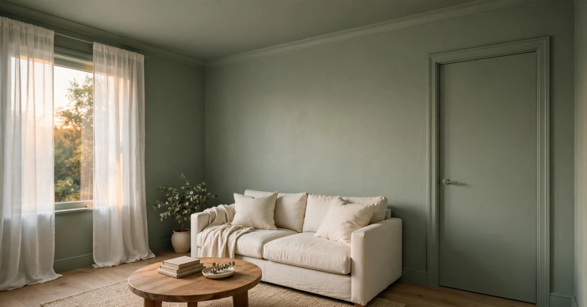
Colour drenching has become one of the more talked-about paint trends in recent years, and for good reason. It’s a technique that can genuinely change how a small room feels.
What Is Colour Drenching? Colour drenching means painting the walls, ceiling, trim, and often the doors all in the same colour, or extremely close shades of it. Instead of using white trim to frame a colored wall, everything blends into one continuous surface.
How Colour Drenching Can Make a Room Feel Larger
By removing the contrast between walls, ceiling, and trim, colour-drenching erases the visual stopping points that normally define a room’s edges. Without a clear line where the wall ends and the ceiling begins, the eye reads the space as one continuous shape rather than a boxed-in room.
This works on walls, ceilings, trim, and architectural details like built-in shelving or wainscoting. The more elements that share the same colour, the more seamless the effect becomes.
When to Use a Color-Drenched Scheme
Colour drenching tends to work best in:
- Small bedrooms, where a cocoon-like feel is welcome
- Cosy living rooms that already lean toward a warm, intimate style
- Rooms with a lot of architectural detail, since drenching can unify busy trim work, mouldings, or built-ins into one clean look
Use Paint to Make a Narrow Room Look Wider
Narrow rooms, like hallways or galley-style spaces, need a different approach than square rooms. The goal here is to trick the eye into reading the space as wider than it is.
Paint Long Walls in Light Colours
Light colours on the long walls of a narrow room help them visually recede, meaning they seem to pull back and create more perceived width.
Use Slightly Darker Paint on Short Walls
Painting the short end walls a touch darker than the long walls can make those ends feel closer, which shortens the perceived length of the room and balances out its proportions.
Decide Whether You Want to Emphasise or Reduce the Room’s Length
Not every narrow room needs to look wider. A long hallway might benefit from a sense of depth and direction instead. If that’s the goal, reverse the approach: use a bolder tone on the far wall to draw the eye forward, rather than trying to minimise the length. The right choice depends on what you want the room to do.
Make a Low Ceiling Look Higher With Paint
Low ceilings are one of the trickiest layout issues to solve with paint, but a few adjustments can make a real difference.
Use a Lighter Colour on the Ceiling
A ceiling that’s lighter than the walls tends to feel like it’s floating higher, since it reflects more light and creates less visual weight overhead.
Use Vertical Stripes or Vertical Details
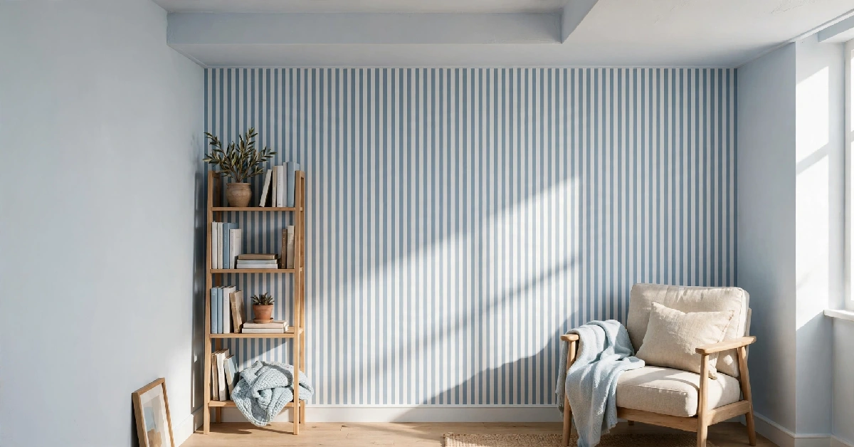
Anything that draws the eye upward, like vertical stripes, tall wainscoting, or narrow panelling, adds a sense of height to a room with a low ceiling.
Reduce Strong Horizontal Colour Breaks
A hard line where one colour meets another, especially if the ceiling is darker, can emphasise how low the ceiling actually sits. Softening or removing that contrast helps the space feel taller.
Extend the Wall Colour Strategically
Carrying the wall colour a few inches onto the ceiling, rather than stopping sharply at the corner, blurs the boundary between wall and ceiling. This small shift can make the room feel like it stretches upward instead of stopping abruptly.
Use Stripes to Change the Room’s Proportions
Stripes aren’t just a design choice. They’re a tool for reshaping how a room reads visually.
Vertical Stripes for More Visual Height
Vertical stripes lead the eye up and down, which adds a sense of height to a room with a lower ceiling or a boxy layout.
Horizontal Stripes for More Visual Width
Horizontal stripes do the opposite. They stretch the eye side to side, which can make a narrow wall or a small room feel wider.
Where to Use Stripes Without Overwhelming the Room
Stripes work best on one accent wall or in a smaller space like a hallway or nook. Covering every wall in a small room with stripes can backfire and make the space feel busy instead of open. Keep contrast between the stripe colours subtle for the most natural effect.
Don’t Automatically Avoid Dark Paint Colours
There’s a common assumption that dark paint always shrinks a room. That’s not entirely true, and it’s worth understanding why.
How Dark Colours Can Create Depth
Dark, saturated colours can actually make walls feel farther away when used consistently across a whole room. Instead of catching the eye at a fixed point, the wall seems to recede into shadow, adding a sense of depth rather than closing the space in.
Deep Blues and Greens for a Receding-Wall Effect
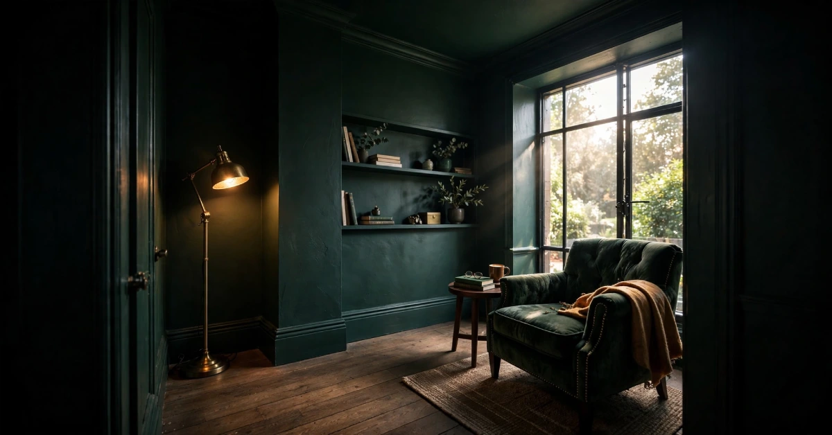
Deep blues, forest greens, and other rich, cool tones tend to work particularly well for this effect. Because these colours already read as receding in nature (think of how a distant forest or the night sky looks), they carry that same quality onto a wall.
When Dark Paint Works Better Than White
Dark paint tends to outperform white in rooms that get little natural light, since a dark, even tone can look more intentional than a dull, shadowy white. It also works well when the goal is a cosy, enclosed feel rather than an airy, open one, such as in a small den or reading nook.
Choose Paint That Works With the Room’s Natural Light
The same paint colour can look completely different depending on how much light a room gets and from which direction.
How Window Direction Changes Paint Appearance
North-facing rooms tend to get cooler, flatter light, which can make some colours look duller or greyer than expected. South-facing rooms get warmer, stronger light that can make colours appear brighter and more saturated than they do on the paint chip.
Best Paint Approach for Bright Rooms
Rooms with strong natural light can handle a wider range of colours, including deeper or cooler tones, without feeling dim. The extra light balances out shades that might otherwise feel heavy.
Best Paint Approach for Dark Rooms
Rooms with limited natural light generally do best with lighter, warmer paint colours that help compensate for the lack of sunlight. Stark whites can sometimes look grey or flat in these rooms, so a soft, warm off-white or pale neutral often reads better.
Test Paint Colours Before Committing
Paint always looks different on a wall than it does on a small chip or a screen. Test a sample directly on the wall and check it at different times of day before settling on a final colour.
Choose the Right Paint Finish
Colour isn’t the only factor. Finish affects how much light a wall reflects and how a room feels overall.
Matte and Flat Finishes
Matte and flat finishes absorb more light and hide small wall imperfections well, but they reflect less light into the room, which can make a small space feel slightly more closed in.
Eggshell and Satin Finishes
Eggshell and satin finishes offer a middle ground. They reflect a bit more light than flat paint while still hiding minor flaws reasonably well, which makes them a solid default for most small rooms.
Higher-Sheen Finishes for Reflecting Light
Semi-gloss and gloss finishes reflect the most light, which can help brighten a room. They work well on trim and doors but can highlight every bump and dent on an entire wall.
Consider Wall Imperfections Before Choosing a Sheen
Higher-sheen paint reflects light, but it also reflects flaws. If your walls have dents, patches, or uneven texture, a higher sheen will draw attention to them. In that case, a low-sheen finish paired with a light colour is usually the safer choice.
Paint the Floor to Make the Room Feel More Open
Floors are often overlooked in this kind of planning, but they play a real role in how open or closed a room feels.
Why Lighter Floors Can Lift a Room
A dark floor can visually anchor a room and make the ceiling feel like it’s pressing down. A lighter floor reflects more light upward and removes that heavy base, which opens up the whole space.
Coordinate Floor and Wall Colours
When floor and wall colours sit close together in tone, the transition between them softens, and the room reads as one continuous space rather than a box with a hard line at the baseboards.
Use Floor Colour to Guide the Eye Through the Space
In open-plan areas, keeping the floor colour consistent from room to room (or using a rug that bridges the tones) helps the eye travel smoothly across the space instead of stopping at each threshold.
Best Paint Strategies for Different Small Rooms
Small Bedroom
- Soft, cohesive colours across walls and trim
- A light ceiling to keep the room from feeling capped
- Minimal contrast between elements for a calm, restful feel
Small Living Room
- Light neutrals as the main palette
- A monochromatic scheme to add depth without adding clutter
- One strategic accent colour, used sparingly, to keep the room from feeling flat
Narrow Hallway
- Monochrome on the long walls to widen the space visually
- Vertical emphasis, such as tall panelling, to add height
Small Room With a Low Ceiling
- A ceiling lighter than the walls
- Vertical elements like stripes or tall furniture to draw the eye upward
Dark Small Room
- Light-reflecting colours with warm undertones
- A close look at the direction and amount of natural light before choosing a final shade
Paint Mistakes That Can Make a Room Feel Smaller
Using Too Many Contrasting Colours
Every new colour adds a visual stopping point. Too many competing shades in one room breaks up the space and makes it feel more cramped than it actually is.
Creating Too Many Visual Boundaries
Sharp contrast between walls, trim, ceiling, and doors adds up to a room full of hard edges. Fewer boundaries generally mean a more open feel.
Choosing a Dark Ceiling Without a Clear Design Purpose
A dark ceiling can work in the right room, but doing it without a plan, especially in a room that’s already short on height, tends to make the space feel lower and heavier than it needs to.
Ignoring Natural and Artificial Lighting
A colour that looks great in a showroom or on a screen can shift entirely under a room’s actual lighting. Skipping this step is one of the most common reasons a paint job doesn’t turn out as expected.
Choosing Paint Without Testing a Sample
Committing to a full room based on a paint chip alone is risky. Undertones, lighting, and finish all change how colour reads once it’s on the wall.
Quick Guide: Which Paint Technique Should You Use?
| Your Room Problem | Best Paint Approach |
|---|---|
| Room feels cramped | Light, cohesive colors |
| Room feels too narrow | Strategic wall contrast |
| Ceiling feels low | Light ceiling + vertical emphasis |
| Room feels dark | Light-reflecting colors |
| Room feels visually busy | Monochromatic scheme |
| Walls feel too clColour | olor drenching or strategic depth |
| Room feels too long | Darker end walls |
Conclusion
Paint colour matters, but where you put the colour matters just as much. A light shade on the walls, a lighter ceiling, reduced contrast between trim and walls, and a finish that suits your room’s light can do more to open up a space than any single “colour ” ever could.
Before you commit to a full room, test a few samples on your actual walls and watch how they shift throughout the day. The right combination isn’t one-size-fits-all. It’s the one that works with your room’s light, layout, and proportions.
FAQs
What colour makes a room look bigger?
Light, reflective colours like white, off-white, pale grey, and soft blue tend to make a room feel bigger because they bounce light around the space instead of absorbing it.
Does white paint make a room look bigger?
Yes, white paint generally makes a room feel bigger because it reflects the most light of any colour. That said, off-white and other pale neutrals can achieve a similar effect with a warmer feel.
What is the best paint colour for a small room?
There isn’t one single best colour. Light neutrals work well in most cases, but the ideal choice depends on the room’s natural light, existing furniture, and the mood you want to create.
Should the ceiling be lighter than the walls?
In most cases, yes. A ceiling that’s lighter than the walls tends to feel higher, which helps a room with a low or standard ceiling feel more open.
Can dark paint make a small room look bigger?
It can, when used consistently across the whole room. Dark, saturated colours can create a sense of depth by making walls appear to recede rather than close in.
Which colour makes a narrow room look wider?
Light colours on the long walls of a narrow room help those walls visually recede, which makes the space feel wider than it is.
Do vertical stripes make a room look taller?
Yes. Vertical stripes draw the eye upward, which adds a sense of height, especially useful in rooms with low ceilings.
Should walls and trim be the same colour in a small room?
Matching or closely blending wall and trim colours removes visual boundaries, which helps a small room feel more open and continuous.
What paint finish is best for making a room look bigger?
Eggshell or satin finishes usually offer the best balance. They reflect enough light to brighten a room without highlighting every wall imperfection the way a higher-sheen finish might.