

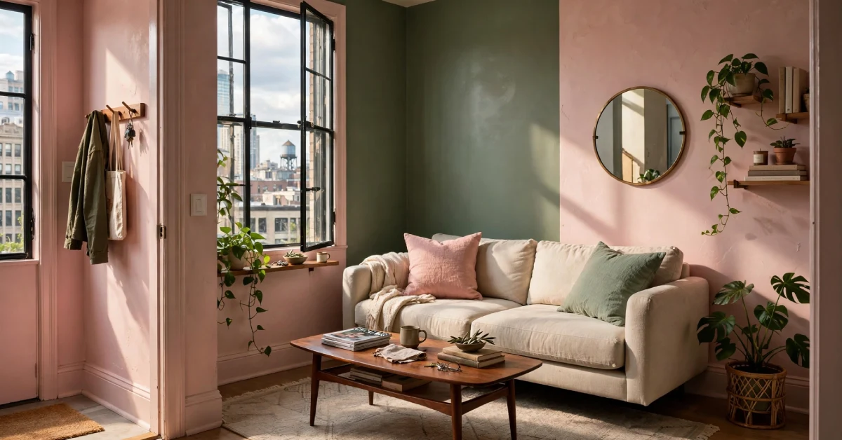
Let me set the scene. A tiny Chicago apartment. Plain white walls. One guy named Alex with a bold idea and a paintbrush. He picked pink and green — and his living room went viral. Why? Because a Pink Green Living Room Paint Makeover feels like nature walked inside and sat on your couch. It’s warm, calm, and surprisingly easy to pull off. No design degree required.
It helps that the combination is having a moment right now, too. Benjamin Moore’s Colour Trends 2026 palette includes Narragansett Green HC-157 alongside First Crush, a soft pink — proof that even the major paint houses are leaning into this pairing.
You don’t need a big budget or a giant space. Just a little courage and the right plan. Let’s get into it.
Why Pink and Green Actually Work Together
These two sit opposite on the colour wheel. That makes them complementary. They boost each other without fighting.
Think about cherry blossoms against green leaves. Your brain loves that image. Pink brings warmth and cheer. Green brings calm and grounding. Together? They create a room that feels alive but not chaotic.
There’s a reason this works so reliably. Designers call it simultaneous contrast — the way colours shift depending on what’s next to them. A warm sage green can read cooler than it actually is when paired with warm-toned furniture like golden oak or beige upholstery. Understanding this helps you avoid the common frustration of a colour “looking different” once the room is furnished. The undertones don’t change — but your perception of them does.
Alex Hinand proved this. He used Benjamin Moore’s Rose Silk on his walls and Vintage Vogue on his trim. The result looked warm, collected, and full of personality. Not like a candy shop — unless that’s your vibe.
Pick the Right Shades for Your Space
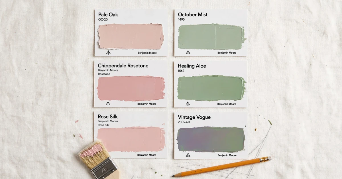
Not every pink works with every green. You need matching undertones.
Warm pink (blush, coral) loves warm green (sage, olive). Cool pink (dusty rose, magenta) pairs with cool green (mint, emerald).
Here’s a quick cheat sheet with actual Benjamin Moore colours so you’re not guessing in the store:
| Pink Shade | BM Color | Green Partner | BM Color | Best For |
|---|---|---|---|---|
| Blush Pink | Pale Oak OC-20 | Sage Green | October Mist 1495 | Small rooms, cosy vibes |
| Rose Pink | Chippendale Rosetone HC-186 | Olive Green | Vintage Vogue 462 | Editorial, modern look |
| Dusty Mauve | First Crush (Trend 2026) | Deep Sage | Narragansett Green HC-157 | Moody, layered warmth |
| Hot Pink | Precocious Pink | Emerald Green | Calypso Green 2046-20 | Bold, glam statement |
One technical detail worth knowing: Light Reflectance Value (LRV). It’s a number from 0 (pure black) to 100 (pure white) that tells you how much light a colour bounces back. Light sage greens typically sit around an LRV of 50–60. Deeper greens like Narragansett Green drop closer to 10–15. In a small room with limited natural light, stick with higher LRV numbers (above 40) so the space doesn’t shrink on you.
The most beginner-friendly combo? Pale Oak OC-20 walls with an October Mist 1495 accent wall behind your sofa. Both are BM best-sellers with warm, balanced undertones that play well together. That’s the secret sauce of any Pink Green Living Room Paint Makeover — balance, not volume.
Plan Your Layout Before You Touch a Paintbrush
Decide which colour leads. Pink walls feel warmer and more intimate. Green walls feel spa-like and nature-inspired.
If your room is narrow, try two-tone banding. Paint the lower third muted green. Paint the upper two-thirds dusty pink. This trick creates the illusion of higher ceilings. Use painter’s tape and a level for clean lines. One designer fixed a crooked band with a slim wooden picture rail — and nobody noticed.
Always test before you commit. Here’s how:
- Sample pots: Paint a big swatch (12×12 inches minimum). Move it around the room throughout the day.
- Peel-and-stick samples: Services like Samplize ship large, real-paint swatches on removable adhesive sheets. No mess, no brush, no wasted sample pot. They carry Benjamin Moore colours and ship quickly — useful if you’re comparing multiple shades at once.
- Benjamin Moore Colourr Portfolio® app: This lets you use your phone’s camera to visualise colours on your actual walls in real time. It’s not a replacement for physical samples, but it’s a fast way to narrow your shortlist before buying anything. Colour that looks perfect at noon can turn muddy under LEDs. And it goes deeper than that — the direction your windows face matters:
- North-facing rooms get cool, bluish light all day. Greens can read cold and flat. Lean toward warmer pinks (blush, peach) and warmer greens (sage, olive) to compensate.
- South-facing rooms get abundant warm light. You have more freedom here — both warm and cool tones look good, though cool pinks and blue-greens will feel especially crisp and fresh.
- East/west-facing rooms shift dramatically between morning and evening. Test your swatches in both conditions before deciding.
6 Playful Paint Ideas to Steal Right Now
Here’s the fun part. These are real ideas from real makeovers.
1. Soft Blush + Sage Accent Wall
Paint three walls in soft blush. Make the fourth wall (behind your sofa) sage green. This gives you depth without overwhelming the space. The tricky part? Picking undertones so pink doesn’t look purple at night. Test your swatches.
2. Two-Tone Horizontal Banding
Lower third = muted green. Upper two-thirds = dusty pink. Budget-friendly and forgiving. Perfect for narrow rooms with low ceilings.
3. Pink Backdrop + Green Nooks
Paint your main area calming pink. Then paint recessed shelves or a TV niche in contrasting green. This creates moments of focus. Great for highlighting plants or art. Use a digital mockup to test proportions first.
4. Patterned Accent with Paint and Stencil
Use a stencil to add a subtle geometric pattern in alternating pink and green tones on one wall. It looks custom without wallpaper costs. The con? Patience. But the result feels bespoke and personality-packed.
5. Colour Drenching
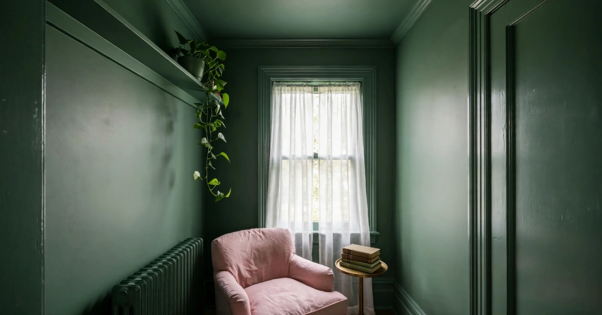
This technique is gaining serious momentum. You paint everything in the room — walls, trim, ceiling, doors, even radiators — in a single colour. In a pink-and-green palette, imagine a small reading nook completely drenched in deep sage, or a powder room floor-to-ceiling in blush. It removes visual interruptions and makes the colour feel like an atmosphere rather than a surface treatment. The trick is choosing a shade with enough LRV variation between matte walls and satin trim to create subtle, tonal depth — even within one colour.
6. Monochrome with Pops of the Opposite Hue
Choose pink or green as your base. Add small pops of the opposite colour in cushions, vases, or a lamp. Safest route for renters or people who change tastes often. I’ve done this in apartments where tenants wanted a fresh look but couldn’t commit to full repainting.
Pro Tips for a Flawless Paint Job
Choose the right product, not just the right colour. Benjamin Moore’s lineup matters more than people realise:
- Regal Select Interior (Eggshell or Pearl) — their workhorse for living room walls. Excellent coverage, washable, and self-levelling so brush marks disappear.
- Aura Interior — their premium line. Colour Lock® technology means richer, true colour with fewer coats. Worth it for bold shades like emerald or deep rose where uneven coverage shows.
- Regal Select Semi-Gloss — for trim, baseboards, and doors. Durable enough to handle scuffs and fingerprints.
Budget paints might save you money per gallon, but they often need three or even four coats for full coverage — especially with deeper pinks and greens. A quality two-coat system with Regal Select or Aura usually ends up costing less in total paint and time.
Don’t skip primer. If you’re covering a dark wall with a lighter shade, or painting over a patchy surface, a proper primer coat prevents bleed-through and gives your colour an even base. Benjamin Moore’s Fresh Start primer is formulated to work with their topcoats. Skipping this step is the number one reason people end up frustrated with their results.
Always paint in daylight when possible. Natural light gives you the most accurate read. If you work at night, use bright warm-white lighting.
Choose eggshell or satin for living room walls. These finishes are durable enough to wipe clean — important if you have kids or pets — but they’re not so reflective that they highlight every wall imperfection. Matte finishes hide flaws best but are harder to wash.
When painting trim in a contrasting colour, use painter’s tape carefully. Press it down firmly with a putty knife. Remove the tape while the paint is still slightly wet. That gives you a clean, crisp line.
Furniture and Decor That Completes the Look
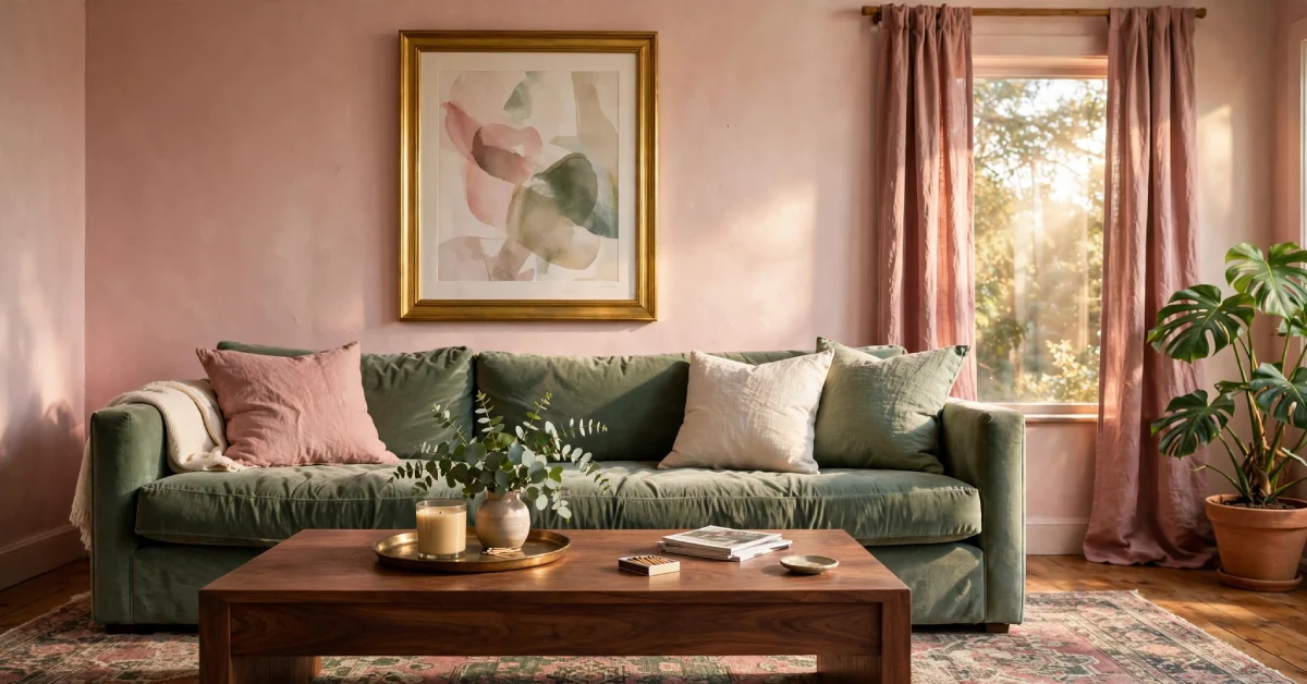
Your walls do the heavy lifting. But furniture makes or breaks the vibe.
Natural wood tones are your best friend. Walnut coffee table. Oak shelving. They ground the palette and keep it from feeling too sweet.
For sofas, think neutral linen — off-white or warm beige. This lets your wall colours breathe. If you want a step beyond basic neutrals, look at greige (grey-beige) or taupe tones — colours like Benjamin Moore Pashmina AF-100 or Ranchwood 2158-30 work as bridging neutrals that connect the warmth of pink with the coolness of green without competing with either. They’re especially useful for larger furniture pieces like sectionals or credenzas where you need the piece to disappear into the scheme rather than dominate it.
Want to go bolder? A sage green velvet sofa against blush pink walls looks incredibly luxurious. Interior designer Melanie Jade paired a dark green sofa with a complementary pink sofa. She said the two colours together felt effortlessly styled.
Bring in gold or brass hardware. Gold-framed mirror. Brass lamp base. Copper candleholders. They add warmth without making the room feel overdone.
Throw pillows, rugs, and artwork are where you layer the palette. A patterned rug that pulls in both pink and green ties the room together. Curtains in dusty rose linen soften the light beautifully if your walls are green. And don’t underestimate houseplants. Real greenery adds texture that fake decor can’t touch.
Common Mistakes to Avoid
Mismatched undertones are the biggest mistake. A warm peachy pink next to a cool blue-toned mint will fight. Always compare chips side by side in your actual room — and remember that simultaneous contrast effect: surrounding furniture and lighting can shift how you perceive a colour’s undertone.
Going too dark in a small room is another one. Two bold saturated colours can feel overwhelming. In compact spaces, use lighter, more muted versions of your shades. A quick check: if both your pink and green have an LRV below 30, at least one of them needs to come up. Let contrast come from decor, not wall colour.
Forgetting lighting entirely? Big mistake. Natural sunlight enhances both colours beautifully. But if your room gets little natural light, use warm-toned bulbs. Cool LEDs can shift blush pink toward lavender or grey. Nobody wants that.
Finally, don’t match everything perfectly. A room where every pink item is the same shade feels stiff. Let colours appear in different textures, finishes, and intensities. That layered quality makes a space feel curated and lived-in.
Budget-Friendly Ways to Try the Trend
Not ready to paint all four walls? No problem.
Paint a single accent wall. Paint an interior door green. Paint your ceiling blush pink above white walls. Any of these creates a big visual impact without a huge investment.
Painting just the trim and baseboards in olive green while keeping walls neutral is another low-commitment test. It reads like a full makeover but uses a fraction of the paint. Alex Hinand’s striped threshold between two rooms — made with painter’s tape and a small roller — is creative, budget-conscious, and playful.
Thrift stores and Facebook Marketplace can introduce the colour palette through furniture. A chartreuse accent chair. A vintage pink lampshade. A sage green ceramic vase. Alex furnished most of his viral apartment through Marketplace, thrift stores, and neighbourhood alleys.
Ready to Grab Your Paintbrush?
A Pink Green Living Room Paint Makeover sounds intimidating until you see it come together. Then you wonder why you waited so long. The combo works because it mirrors nature. Pink flowers. Green leaves. Blush sunsets over grassy hills.
Start with a few paint swatches — or a peel-and-stick pack if you want zero mess. Use the Colour Portfolio app to visualise them on your walls before you even open a can. Observe them in your actual space across different lighting conditions. Trust your instincts. Whether you go bold with emerald and fuchsia or keep it gentle with sage and blush, the most important thing is that the space feels like you.
FAQs
Can pink and green really work together in a small living room?
Yes — when you balance saturation and use one as primary, one as accent. Stick with higher LRV shades (above 40) so the space stays open. The combo feels intentional, not chaotic.
Which paint finish is best for living rooms?
Satin or eggshell. Durable enough for wiping. Not so reflective that it highlights wall imperfections. For trim and doors, step up to semi-gloss for added toughness.
How do I choose the right pink and green tones?
Test swatches in morning and evening light. Pay attention to which direction your windows face — north-facing rooms need warmer tones, south-facing rooms handle cool and warm equally. Use peel-and-stick samples from services like Samplize to compare shades side by side without committing to sample pots. Bring home big sample cards and live with them for a few days.
How many coats of paint will I need?
With quality paint like Benjamin Moore Regal Select or Aura, plan on two coats over a primed surface. Budget paints often need three or four — especially for deeper pinks and greens — which is why a premium product can actually cost less overall.
Will pattern stencilling make a small room feel busy?
Not if you keep the pattern scale small and limit it to a single wall or niche. Narrow-repeat stencils add interest without shrinking the space.
Can I use this pink-and-green palette outside the living room?
Absolutely. The same undertone principles apply to bedrooms, kitchens (cabinet painting is a popular application), and even exteriors. A sage green front door with a blush-pink interior hallway is a subtle way to carry the palette through your home.
Any advice on pairing fabrics with pink and green walls?
Neutral textures like linen and natural wood ground the palette. Greige and taupe tones work especially well as bridging neutrals for larger upholstery pieces. If you add patterned cushions, choose a unifying colour to repeat across the room.