

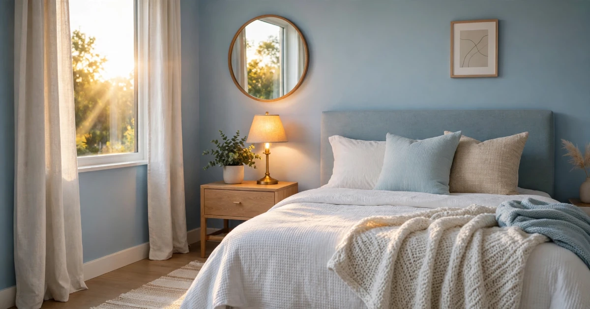
A blue bedroom combines calming aesthetics with practical design to create a space that feels both stylish and restorative. From soft pastels to deep navy, blue works across multiple design styles and pairs naturally with various color palettes.
The key to success lies in selecting the right shade for your space, colour-coordinating it with complementary colours, and using lighting and textures to prevent the room from feeling cold or overwhelming.
Why Blue Works for Bedrooms
Blue has held a strong position in interior design for good reason. According to colour psychology research, blue tones trigger the production of calming hormones and reduce heart rate, making them ideal for spaces dedicated to rest. Unlike trendy colours that fade from favour, blue has remained a consistent choice for bedrooms over decades because it actually supports better sleep quality.
The versatility of blue is remarkable. A single colour family spans from barely-there powder blue to rich midnight navy. This range means blue works whether you prefer minimalist modern design, traditional cottage style, beachy coastal vibes, or eclectic bohemian spaces. You can build an entire bedroom around blue or use it as an accent that ties together other design elements.
Another practical advantage: blue pairs naturally with almost every other colour. White creates freshness and contrast. Warm neutrals like beige and taupe add cosiness. Gold and brass bring luxury. Even unexpected combinations like blue with terracotta or sage green work beautifully.
Different Shades of Blue and Their Effects
The specific shade you choose matters more than you might think. Each variation creates a distinctly different feeling in your room.
Pale and Powder Blue: These delicate shades feel light and airy. They work well in smaller bedrooms because they make spaces feel more open. Pale blue pairs beautifully with white bedding and natural wood furniture. This shade is also popular for kids’ rooms and guest bedrooms because it feels welcoming without being overly bold.
Sky Blue: Slightly deeper than pale blue, sky blue brings more personality while remaining cheerful. This shade works particularly well in rooms with good natural light. It references the actual sky, which creates a psychological connection to nature and openness. Many people find sky blue more interesting than pale blue while still maintaining a calm atmosphere.
Slate and Dusty Blue: These muted, slightly grey-toned blues feel sophisticated and mature. They work well in master bedrooms where you want to project calm confidence rather than whimsy. Dusty blue pairs beautifully with soft textures like linen and velvet. This shade also coordinates well with vintage and cottage-style furniture.
Teal and Turquoise: These blue-green hybrids bring more energy than pure blue while maintaining its calming properties. Teal works particularly well when you want blue but feel like traditional blue is too cool or predictable. Use teal as an accent wall or in smaller doses rather than as the dominant bedroom colour.
Navy and Deep Blue: Deep blues make a bold statement. They work best in rooms with good lighting because they absorb light and can make spaces feel smaller. Navy bedrooms work beautifully when balanced with light-colored furniture, pale bedding, and strategic lighting. The drama of deep blue creates a luxurious, intimate atmosphere that many people find more restful than lighter shades.
Practical Considerations Before Choosing Your Blue
Selecting blue for your bedroom involves more than just liking the colour. A few practical factors will determine whether your choice works long-term.
Lighting matters significantly. Blue behaves differently under various light sources. Natural daylight will show blue most accurately. Warm-toned incandescent bulbs can make blue feel slightly purple or muddy. Cool-toned LED lights keep blue looking fresh. If you’re considering a deep blue, test it in your actual room under your actual lighting before committing. What looks perfect in the paint store might feel too dark or too cold in your space.
Room size influences shade selection. Pale and medium blues feel spacious in small rooms. Deep navy or teal can make a generous bedroom feel more intimate, but in a small space it might feel cramped. If your bedroom is compact, stick with lighter shades or use deep blue only on one accent wall.
Natural light availability affects your options. A north-facing bedroom gets cooler light, so slightly warmer blues work better. A south-facing room with plenty of warm sunlight can handle deeper, cooler blues. A room with minimal natural light needs medium to pale blue to avoid feeling cave-like.
Your existing décor sets parameters. If you have wood furniture in warm tones, cooler blues might clash. If your furniture is light or whitewashed, any blue will work. Consider what you already own and what you plan to keep.
Colour Combinations That Work With Blue
While blue is forgiving, pairing it with complementary colors elevates the entire room.
Blue and White: This classic combination never feels out of style. White bedding, white trim, and white furniture create maximum contrast against blue walls, making the space feel fresh and organised. This pairing works across all shade ranges from pale blue to navy.
Blue and Warm Neutrals: Beige, taupe, cream, and soft grey balance blue’s coolness. Use these colours in bedding, area rugs, and upholstered furniture. This combination creates a sophisticated, calming bedroom that feels both modern and timeless. It’s particularly effective with slate, dusty, or muted blues.
Blue and Natural Wood: Light or medium wood tones create warmth against cool blue. Wood nightstands, bed frames, or dressers prevent the room from feeling too sterile. This pairing works especially well with navy or deep blue because the wood adds necessary warmth.
Blue and Metallic: Gold, brass, and copper accents bring luxury to blue bedrooms. Gold works beautifully with navy and deeper blues. Brass coordinates well with medium and slate blues. Keep metallic accents to hardware, lighting fixtures, or mirror frames rather than covering surfaces.
Blue and Soft Greens: Green and blue are neighbouring colours on the spectrum, so they coordinate naturally. Pale sage or soft eucalyptus tones paired with blue create a nature-inspired, restful atmosphere. This combination works particularly well if you’re incorporating plants into your bedroom.
Creating Your Blue Bedroom: Design Approaches
Most people choose one of three approaches to incorporating blue into their bedroom. Each offers different levels of commitment and impact.
Full Wall Paint: Painting all four walls blue creates an immersive environment. This works best with lighter shades in smaller rooms or when you have good lighting. Deep blue on all walls is bold and works in larger bedrooms with generous natural light. Paint creates a cohesive look and is relatively affordable compared to other design investments.
Accent Wall: One wall of blue creates focal point interest without committing your entire space. This approach works well if you’re testing how blue feels in your room. An accent wall typically works best behind your bed, drawing attention to the room’s focal point. You can paint the remaining walls white, cream, or very pale gray to let the blue wall command attention.
Blue Through Textiles: If painting feels too permanent, introduce blue through bedding, curtains, throw pillows, and area rugs. This approach lets you change your mind relatively easily and works well in rental spaces. Layer different shades and textures of blue to create visual interest without the commitment of painted walls.
Furniture and Fixture Selection for Blue Rooms
Your furniture choices determine whether a blue bedroom feels finished or incomplete.
Bed frames work best in white, natural wood, or upholstered styles. An upholstered headboard in a complementary colour can anchor the room. Avoid dark wood frames in very pale blue rooms, as the contrast can feel disconnected.
Dressers and nightstands in natural wood, white-painted wood, or light finishes keep the room from feeling too heavy. In deep blue rooms, lighter furniture prevents the space from feeling dark or cave-like.
Window treatments significantly impact how light interacts with blue. Sheer white curtains let light pass through while blue walls filter it, creating a calming glow. Heavier linen drapes in natural fibre tones add cosiness. Avoid heavy blackout curtains unless your room needs darkness for sleep.
Lighting fixtures should provide layered lighting: overhead for general illumination, bedside lamps for reading, and accent lighting for ambience. Warm-toned bulbs (2700K colour temperature) complement blue without making it look purple.
Texture and Pattern Balance
Blue walls need textural variation to feel interesting rather than flat. Soft, touchable elements make the room feel inviting.
Add visual interest through layered bedding. Combine a solid blue sheet set with a textured duvet cover, add throw pillows in varied patterns, and finish with a knit or linen throw blanket. This approach creates depth without visual chaos.
Incorporate natural materials like linen curtains, jute area rugs, woven baskets, and wood accents. These elements add warmth and prevent the room from feeling sterile or cold.
Patterns work well in moderation. Soft geometric patterns, subtle florals, or stripes on throw pillows or curtains create visual interest without overwhelming the space. Stick with one or two patterns and keep them relatively small-scale.
Mirrors serve both practical and visual purposes. A large mirror reflects light and makes the room feel more spacious. In deep blue rooms, a mirror opposite a light source bounces light back into the space, counteracting the room’s tendency to absorb light.
Room-Specific Guidance
Master Bedroom: Use deeper shades like navy or slate blue to create a sophisticated retreat. Pair with warm neutrals, good lighting, and quality textiles. A blue master bedroom should feel like a sanctuary from the rest of your home.
Guest Bedrooms: Lighter shades of blue feel more welcoming. Pale or sky blue paired with white bedding creates an inviting space that doesn’t impose your personal style too strongly. The goal is making guests feel comfortable rather than showcasing your design preferences.
Small Bedrooms: Pale to medium blue works best. Pair with white furniture and plenty of lighting to maximise the sense of space. Avoid deep blue on all walls unless you have exceptional natural light.
Children’s Rooms: Sky blue or pale blue creates a calm learning and sleeping environment. Avoid using blue as purely a gender assignment. Blue works beautifully for any child’s room and creates a genuinely calming atmosphere that supports better sleep and concentration.
Budget-Conscious Approaches
You don’t need significant spending to create a beautiful blue bedroom.
Start with bedding. A new blue duvet cover and coordinating pillows cost significantly less than painting or buying new furniture. This is the quickest way to test how blue feels in your space.
Paint a single accent wall rather than your entire room. A can of quality paint costs between thirty and fifty dollars and transforms the room immediately.
Use what you already own. If you have wooden furniture in natural finishes, it likely coordinates beautifully with blue. Skip the furniture replacement and focus on colour and textiles.
Shop secondhand for larger pieces. A dresser or nightstand from a thrift store or online marketplace often costs far less than new furniture and adds character to the room.
Bringing It All Together
A blue bedroom succeeds when the shade works with your lighting, the furniture complements the colour, and the textures prevent the space from feeling cold or flat. Start by identifying which blue shade appeals to you most, then test it in your actual room under your actual lighting. This single step prevents most design mistakes.
Remember that blue’s strength is its flexibility. Whether you prefer serene and subtle or bold and dramatic, a shade of blue exists that works for your style. Consider your room’s lighting, size, and existing furniture. Select complementary colours and textures that balance blue’s coolness. Incorporate adequate lighting for nighttime function and visual warmth.
Your bedroom should reflect your personality while supporting restful sleep. Blue makes that balance achievable because it genuinely calms the nervous system while offering enough variety to suit any design preference. Start with one element, whether that’s paint, bedding, or accessories, and build from there. The best bedrooms develop gradually with choices that make you feel genuinely at home.
FAQs
Does blue bedroom paint make rooms feel cold?
Not necessarily. Blue’s temperature depends on the specific shade. Warmer blues with greyish undertones feel cosier than purely cool blues. Warm-toned lighting and natural wood furniture also counteract any coolness.
What’s the best lighting for a blue bedroom?
Warm-toned bulbs (2700K) work best with most blue shades. They make blue feel cosy rather than clinical. Layer your lighting with overhead fixtures, bedside lamps, and soft accent lighting.
Can I use bright or neon blue in a bedroom?
Highly saturated bright blue is stimulating rather than calming. Bedrooms work best with muted, medium, or deep blues. Save bright blue for accents or other rooms in your home.
How do I prevent my blue bedroom from feeling too dark?
Use pale to medium blue rather than deep navy. Incorporate light-colored furniture, plenty of white or cream bedding, and mirrors to reflect light. Ensure your lighting is adequate for nighttime visibility.
What if I paint blue and hate it?
Paint covers well. Most blue walls take just two coats of white or neutral paint to cover completely. Testing paint in your room before committing to the full job helps prevent this situation.
Does blue help with sleep?
Blue’s calming properties and associations with sky and water do support relaxation. However, extremely bright or neon blue is stimulating. Medium to deeper, muted blues promote better sleep.