

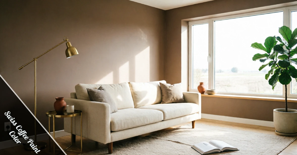
Picking a white paint sounds easy until you’re standing in the aisle holding ten nearly identical swatches. Swiss Coffee Paint Color keeps showing up on every designer’s shortlist, and once you see it in person, it’s easy to understand why. It has the same warm, pulled-together feel you’d want in a cozy apartment, minus the stark, clinical edge that a lot of “safe” whites carry.
This shade has been a go-to for years, but it’s had a real moment lately as more homeowners move away from the cool, greige-heavy palettes that dominated the last decade. People want warmth back on their walls, and Swiss Coffee delivers that without swinging all the way into cream or beige territory.
What Makes Swiss Coffee Paint Color Different?
Swiss Coffee is a soft, creamy off-white with a low Light Reflectance Value, which means it reads warmer than a stark white but never tips into beige. Most homeowners describe it as a white that still feels cozy, even in rooms that don’t get much sun.
The undertone leans slightly yellow, sometimes with a hint of grey depending on the light hitting it. That subtle shift is exactly why Swiss Coffee Paint Color photographs so well in real estate listings and home tours. It looks bright without feeling cold, and it works across almost any style of home, from farmhouse to modern minimalist.
It’s also one of the more forgiving whites on the market. Unlike some bright whites that show every shadow and imperfection, Swiss Coffee softens the harsh edges of a wall, which makes older homes with slightly uneven plaster look a lot more polished.
How Lighting Changes the Way It Looks
Paint color never behaves the same way twice, and Swiss Coffee Paint Color is no exception. Room direction changes everything about how the shade actually reads once it’s dry.
In a north-facing room, natural light tends to be cooler and bluer, so Swiss Coffee can look slightly grey by midday. South-facing rooms get warmer, more direct sunlight, which brings out the creamy undertone and makes the wall glow a little in the afternoon.
East-facing rooms show Swiss Coffee at its warmest in the morning, then it settles into a neutral tone by evening. West-facing spaces flip that pattern, staying neutral for most of the day before warming up as the sun sets and the light turns golden.
Artificial lighting matters too. Warm bulbs will amplify the creamy undertone, while cooler LED lighting can flatten it out and push it toward a plainer white. Testing a sample on your actual wall, at different times of day, under your actual light fixtures, is still the only way to know for sure.
Swiss Coffee vs Other Popular Whites
A lot of buyers compare this shade against the other big names before committing. Here’s how it stacks up against the paints people usually cross-shop:
| Paint Color | Undertone | Best Use |
|---|---|---|
| Swiss Coffee | Warm, slightly yellow | Living rooms, bedrooms, trim |
| White Dove | Neutral, soft grey | Cabinets, trim, whole-house white |
| Simply White | Warm, clean | Ceilings, exteriors |
| Alabaster | Warm, beige-leaning | Walls in warm-toned rooms |
Swiss Coffee sits right in the middle of that group. It’s warmer than White Dove but cleaner than Alabaster, which is exactly why it works as a whole-house color instead of just a trim shade. Most major brands, from Behr to Dunn-Edwards to Valspar, carry a close match if your local store doesn’t stock the exact original formula.
Best Rooms for Swiss Coffee
Living rooms and bedrooms are where this color shines the most, since the warmth keeps the space feeling lived-in rather than showroom-sterile. Open-plan living areas benefit too, because the shade carries the same warmth from the kitchen through to the sitting area without any jarring transition between rooms.
If you’re leaning into a maximalist look, pairing a warm white base with bold accent pieces works surprisingly well. It’s the same logic behind good dopamine decor for small spaces: a calm, warm wall lets brighter furniture and art actually stand out instead of competing with the color behind them.
Kitchens with wood flooring or quartz countertops also pair naturally with Swiss Coffee Paint Color, since the warm undertone bridges the gap between natural wood tones and cooler stone surfaces. Bathrooms with marble countertops get a similar benefit, since the softness keeps the space from feeling clinical.
Trim, Cabinets, and Coordinating Colors
Swiss Coffee works well on walls, but it also holds up on trim, doors, and cabinets. Because it’s warm rather than stark, it won’t clash against wood tones the way a cooler white sometimes does when placed side by side.
For cabinets specifically, this shade gives a soft, warm finish that photographs beautifully next to brass or matte black hardware. Pair it with warm neutral accents like tan, sage, or terracotta for a coordinated palette that doesn’t feel matchy or overly planned.
If you’re painting an entire open-plan space, keep the trim a shade lighter than the walls so the architectural details still stand out instead of blending into the background.
Choosing the Right Finish
The finish you pick matters almost as much as the color itself. Eggshell is the go-to for living rooms and bedrooms since it hides small imperfections while still catching a soft sheen under natural light.
Satin holds up better in kitchens and bathrooms, where you’ll be wiping down walls more often and need something that won’t stain or scuff easily. Semi-gloss is worth saving for trim and doors, since the higher shine makes those details pop against a flatter wall finish.
Matte finishes look elegant but scuff easily, so they’re better suited to low-traffic rooms like formal dining spaces or guest bedrooms that don’t see much daily wear.
Common Mistakes to Avoid
The biggest mistake people make with Swiss Coffee Paint Color is skipping the sample stage. A swatch on a paint chip looks nothing like a full wall under your actual lighting, so always test a patch and check it morning, noon, and night before committing to gallons.
Another common slip is ignoring the room’s existing warm or cool elements, like flooring or countertops, which can throw off how the undertone reads once it’s finally on the wall. Don’t assume one can cover everything, either. Lighting, sheen, and even the brand’s specific formula can shift the final look more than most people expect going in.
A third mistake is pairing it with the wrong trim white. A cooler trim shade next to Swiss Coffee walls can make both colors look slightly off, so it’s worth testing trim and wall samples side by side before buying either.
If you’re already mid-renovation and weighing wall treatments beyond a flat coat, it’s worth glancing at ideas like a DIY accent wall to see how a warm neutral can anchor a feature wall instead of just coating four flat surfaces.
Swiss Coffee has earned its popularity for a reason. It’s warm enough to feel welcoming, neutral enough to match almost any furniture or flooring, and forgiving enough that it rarely looks like a mistake once it’s dry. Test it in your own space first, but there’s a good chance it’ll end up exactly where you hoped it would.