

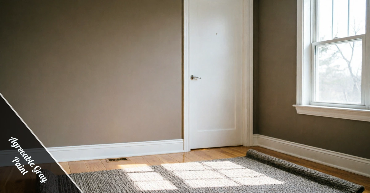
Agreeable Gray Paint by Sherwin-Williams is the neutral everyone keeps talking about, and honestly, for good reason. It works everywhere in a home, from living rooms to bathrooms, without ever feeling like the wrong choice.
It’s been a best-seller for years, and once you see it on a wall in person, it’s easy to understand exactly why homeowners keep choosing it over trendier options.
What Is Agreeable Gray Paint, Really?
It’s technically a greige, that in-between shade mixing warm beige with cool gray, so it never feels flat or boring on a wall.
If you’re refreshing more than one room, this color pulls double duty. It works in living rooms, bedrooms, hallways, and even bathrooms without missing a beat.
The official code is SW 7029, and it sits in the greige family alongside cousins like Repose Gray and Anew Gray.
Think of it as your home’s neutral wingman.
It shows up quietly, but it makes everything else in the room look sharper, from your furniture to your artwork on the walls.
Designers reach for it constantly because it photographs well and rarely fights with existing decor, which saves you a full redecorate.
It’s also one of the most requested paint colors year after year, which tells you homeowners keep coming back to it for a reason.
The Undertones You Need to Know
Undertones are the hidden layer of a paint color, the tone that peeks through once color hits your wall in real light.
Agreeable Gray leans warm first, with a soft beige base that keeps rooms feeling cozy instead of cold or clinical.
But there’s a twist. In certain light, especially against cool-toned furniture or gray stone, it can shift toward a faint green cast.
That’s not a flaw; it’s just how greige colors behave, and it’s exactly why testing matters before you commit a whole gallon.
Most homeowners find the shift subtle enough that it still reads as a warm, livable neutral day to day.
Pair it with warm metals and natural wood if you want the beige side to stay front and center.
Cooler accents, like brushed nickel or charcoal furniture, will nudge the room toward that greenish gray instead.
Best Rooms for This Color
This color earns its reputation as a whole-home neutral because it genuinely works almost everywhere in a house.
Living rooms, dining rooms, hallways, and primary bedrooms all handle it well, especially with natural light pouring in during the day.
Bathrooms can work too, though you’ll want a paint formulated for moisture and a sheen that resists mildew over time.
Small, dark rooms with little natural light are the trickiest spot, since the color can read a bit flat or muddy without enough brightness bouncing around.
If your space leans dark, pair it with brighter trim and layered lighting to keep the room from feeling heavy.
North-facing rooms tend to cool the color down, while south-facing rooms warm it up nicely all afternoon.
Open-concept spaces benefit too, since one consistent neutral keeps the eye moving smoothly from kitchen to living room without a jarring stop.
How Lighting Changes the Shade
Paint color is never fixed; it shifts constantly depending on the light source hitting your walls throughout the day.
Morning sun brings out the warmth in Agreeable Gray Paint, while afternoon shadows can pull it toward a cooler, grayer tone.
Artificial lighting matters just as much. Warm bulbs deepen the beige, while cool LED bulbs push the color toward that faint green undertone we mentioned earlier.
This is the number one reason paint looks different online than it does on your actual wall at home.
Always check a sample at different times of day before you paint the whole room from top to bottom.
Even the direction your windows face changes things, so don’t assume a friend’s living room will match yours exactly.
Overhead lighting versus lamp light also makes a difference, since a single ceiling fixture reads Agreeable Gray Paint differently than layered floor lamps do.
Trim, Cabinets, and Coordinating Colors
Crisp white trim is the classic pairing for this shade, and it’s a combination that seldom misses.
Sherwin-Williams Pure White, Extra White, and Alabaster all work beautifully, each bringing a slightly different level of brightness and warmth.
For kitchen cabinets, Agreeable Gray Paint gives you a soft, updated neutral that pairs well with brass, black, or brushed nickel hardware.
It also plays nicely with warm wood tones, so open shelving or a butcher block island still feels grounded and welcoming.
Once your cabinets and walls are done, don’t forget the small details that keep a kitchen looking finished, like keeping your stovetop spotless after every meal you cook.
A few accent colors, like a deep navy or a muted terracotta, add contrast without fighting the neutral base underneath.
Matte black fixtures give the whole kitchen a slightly more modern edge if that’s the direction you’re leaning.
Flooring Pairings That Work
Warm oak and honey-toned hardwood floors bring out the beige side of this color, creating a cozy, balanced look.
Darker walnut floors lean the room cooler, giving the space a more modern, grounded feel overall throughout the day.
Steer clear of pink-beige tile or violet-gray stone, since both can clash with the natural undertone and make it look off.
Neutral rugs in cream, taupe, or soft gray tie the whole room together without competing for attention.
If your flooring already leans warm, the paint will feel like it was chosen on purpose, not an afterthought.
Even gray-toned laminate can work, as long as you keep the undertones consistent between floor and wall.
Light oak floors brighten the whole room, which is a great fix if your space doesn’t get much natural sun.
Agreeable Gray vs Repose Gray
Repose Gray is the other big name in this family, and people mix the two up constantly online.
Repose Gray sits slightly cooler and lighter, with less beige pulling through, which makes it feel a touch more modern.
Agreeable Gray Paint, on the other hand, leans warmer and works better in rooms that need a cozier feel.
Both have a light reflectance value in the high 50s to low 60s, so neither one will feel dark or heavy on your walls.
If you’re stuck between the two, sample both side by side in your actual room before deciding anything.
Neither color is objectively better; it really just comes down to whether your room needs more warmth or more cool.
Anew Gray and Mega Greige round out the same color strip, giving you two more shades to compare against Agreeable Gray Paint if neither top pick feels quite right.
Common Mistakes to Avoid
The biggest mistake homeowners make is skipping the sample step entirely and trusting a photo they saw online.
Screens and lighting distort color constantly, so what looks perfect on your phone might read completely different on your wall.
Another common slip is painting one small swatch and judging the whole room from it, which rarely gives you the full picture.
Uneven coverage is a real risk too if you rush the job or skip primer, and it’s an easy problem to prevent if you slow down.
Give yourself time to test, prime properly, and let each coat dry before judging the final result on your wall.
Rushing sheen choice is another slip, since a glossy finish shows every bump while a flat finish hides them.
Eggshell or satin usually strikes the right balance for walls, giving you a soft sheen that still wipes clean easily.
Testing Samples Before You Commit
Peel-and-stick samples are the easiest way to preview this color without committing to a full can of paint.
Move the sample around the room and check it in morning light, afternoon light, and under your regular lamps.
A liquid sample painted onto a poster board works even better, since you can move it wherever you need to check.
Live with it for a few days before making your final call, since color perception shifts as your eyes adjust.
Agreeable Gray Paint has earned its popularity honestly, and a little testing upfront makes sure it earns a spot in your home too.
Buy the smallest sample size your store offers, since you only need enough to cover one poster board or a small wall patch.
Final Thoughts
At the end of the day, a paint color is only as good as how it feels in your own space, under your own light. And if your first coat goes on a little patchy, don’t panic; fixing uneven paint is easier than most people expect.
Agreeable Gray Paint keeps showing up in homes across every style because it adapts instead of demanding the room adapt to it.